2017年8月29日 星期二

[Python] 機器學習筆記 - 使用 seaborn 呈現資料狀態(數據視覺化)

這陣子被高手推坑 kaggle ,越看越有動力,就順勢把很久以前欠的知識技術順勢補一下:資料視覺化。

在數據分析的比賽,默認的資料多是 csv 格式,接著用 panda 讀取,再用 seaborn 和 matplotlib.pyplot 繪圖。透過第一步的視覺化,快速得知數據分佈狀態,甚至在

輸入資料:

     total_bill   tip     sex smoker   day    time  size
0         16.99  1.01  Female     No   Sun  Dinner     2
1         10.34  1.66    Male     No   Sun  Dinner     3
2         21.01  3.50    Male     No   Sun  Dinner     3
3         23.68  3.31    Male     No   Sun  Dinner     2
4         24.59  3.61  Female     No   Sun  Dinner     4
5         25.29  4.71    Male     No   Sun  Dinner     4
6          8.77  2.00    Male     No   Sun  Dinner     2
7         26.88  3.12    Male     No   Sun  Dinner     4
8         15.04  1.96    Male     No   Sun  Dinner     2
9         14.78  3.23    Male     No   Sun  Dinner     2
10        10.27  1.71    Male     No   Sun  Dinner     2
11        35.26  5.00  Female     No   Sun  Dinner     4
12        15.42  1.57    Male     No   Sun  Dinner     2
13        18.43  3.00    Male     No   Sun  Dinner     4
14        14.83  3.02  Female     No   Sun  Dinner     2
15        21.58  3.92    Male     No   Sun  Dinner     2
16        10.33  1.67  Female     No   Sun  Dinner     3
17        16.29  3.71    Male     No   Sun  Dinner     3
18        16.97  3.50  Female     No   Sun  Dinner     3
19        20.65  3.35    Male     No   Sat  Dinner     3
20        17.92  4.08    Male     No   Sat  Dinner     2
21        20.29  2.75  Female     No   Sat  Dinner     2
22        15.77  2.23  Female     No   Sat  Dinner     2
23        39.42  7.58    Male     No   Sat  Dinner     4
24        19.82  3.18    Male     No   Sat  Dinner     2
25        17.81  2.34    Male     No   Sat  Dinner     4
26        13.37  2.00    Male     No   Sat  Dinner     2
27        12.69  2.00    Male     No   Sat  Dinner     2
28        21.70  4.30    Male     No   Sat  Dinner     2
29        19.65  3.00  Female     No   Sat  Dinner     2
..          ...   ...     ...    ...   ...     ...   ...
214       28.17  6.50  Female    Yes   Sat  Dinner     3
215       12.90  1.10  Female    Yes   Sat  Dinner     2
216       28.15  3.00    Male    Yes   Sat  Dinner     5
217       11.59  1.50    Male    Yes   Sat  Dinner     2
218        7.74  1.44    Male    Yes   Sat  Dinner     2
219       30.14  3.09  Female    Yes   Sat  Dinner     4
220       12.16  2.20    Male    Yes   Fri   Lunch     2
221       13.42  3.48  Female    Yes   Fri   Lunch     2
222        8.58  1.92    Male    Yes   Fri   Lunch     1
223       15.98  3.00  Female     No   Fri   Lunch     3
224       13.42  1.58    Male    Yes   Fri   Lunch     2
225       16.27  2.50  Female    Yes   Fri   Lunch     2
226       10.09  2.00  Female    Yes   Fri   Lunch     2
227       20.45  3.00    Male     No   Sat  Dinner     4
228       13.28  2.72    Male     No   Sat  Dinner     2
229       22.12  2.88  Female    Yes   Sat  Dinner     2
230       24.01  2.00    Male    Yes   Sat  Dinner     4
231       15.69  3.00    Male    Yes   Sat  Dinner     3
232       11.61  3.39    Male     No   Sat  Dinner     2
233       10.77  1.47    Male     No   Sat  Dinner     2
234       15.53  3.00    Male    Yes   Sat  Dinner     2
235       10.07  1.25    Male     No   Sat  Dinner     2
236       12.60  1.00    Male    Yes   Sat  Dinner     2
237       32.83  1.17    Male    Yes   Sat  Dinner     2
238       35.83  4.67  Female     No   Sat  Dinner     3
239       29.03  5.92    Male     No   Sat  Dinner     3
240       27.18  2.00  Female    Yes   Sat  Dinner     2
241       22.67  2.00    Male    Yes   Sat  Dinner     2
242       17.82  1.75    Male     No   Sat  Dinner     2
243       18.78  3.00  Female     No  Thur  Dinner     2

[244 rows x 7 columns]


繪出資料分佈/密布圖:
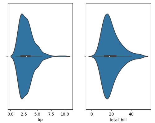
sns1

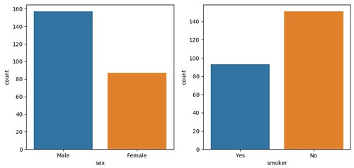
繪出資料筆數:

sns2

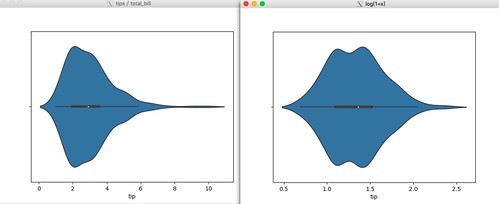
繪出 log(1+x) 的效果(以 tip 為例):

sns3

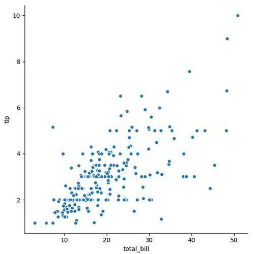
兩兩欄位計算相關性,並繪出分佈圖:

sns4

程式碼:

import matplotlib.pyplot as plt
import seaborn as sns

tips = sns.load_dataset("tips")
print(tips)

# https://seaborn.pydata.org/generated/seaborn.violinplot.html
plt.figure('tips / total_bill')
plt.subplot(1,2,1)
sns.violinplot(data=tips, x='tip')

plt.subplot(1,2,2)
sns.violinplot(data=tips, x='total_bill')

# https://seaborn.pydata.org/generated/seaborn.countplot.html
plt.figure('sex / smoker')
plt.subplot(1,2,1)
sns.countplot(data=tips,x='sex')
plt.subplot(1,2,2)
sns.countplot(data=tips,x='smoker')

import numpy as np

plt.figure('log(1+x)')

# https://docs.scipy.org/doc/numpy/reference/generated/numpy.log1p.html
tips['tip'] = np.log1p(tips['tip'])
sns.violinplot(data=tips, x='tip')

# https://pandas.pydata.org/pandas-docs/stable/generated/pandas.DataFrame.corr.html
data_corr = tips.corr()
print(data_corr)

threshold = 0.5
corr_list = []
size = data_corr.shape[0]
for i in range(0,size):
for j in range(i+1,size):
if (data_corr.iloc[i,j] >= threshold and data_corr.iloc[i,j] < 1) or (data_corr.iloc[i,j] < 0 and data_corr.iloc[i,j] <= -threshold):
corr_list.append([data_corr.iloc[i,j],i,j])

s_corr_list = sorted(corr_list,key=lambda x: -abs(x[0]))
print(s_corr_list)

cols=data_corr.columns
for v,i,j in s_corr_list:
print ("%s and %s = %.2f" % (cols[i],cols[j],v))
sns.pairplot(tips, size=6, x_vars=cols[i],y_vars=cols[j] )

plt.show()


最後,有時資料內有垃圾需要清除後在繪圖,可以善用 pandas.DataFrame.dropna 來過濾資料:

# https://pandas.pydata.org/pandas-docs/stable/generated/pandas.DataFrame.dropna.html
# 繪圖時,刪除 nan 的資料
newdata = rawdata.dropna(axis=0)
sns.violinplot(newdata)

# https://pandas.pydata.org/pandas-docs/stable/generated/pandas.DataFrame.drop.html
# 繪圖時,只關注特定範圍的資料(此例:總額 < 20 都刪除不繪)

newdata = tips.drop(tips[ tips.total_bill < 20 ].index)
sns.violinplot(data=newdata, x='tip')

2017年8月26日 星期六

真愛每一天 = 過好每一天


最近工作上的事物又忙碌了起來,許多事交錯著,不只有 coding 的步調,還有跨單位的以及人性管理課題。此外,正逢台灣承辦世大運,社會新聞一樣熱熱鬧鬧著。

年過三十後,對於時間有種恐懼和焦慮感,很貴很貴,卻也無法改變什麼 XD 最近也小玩一下數據分析,跑個 SVC 就搞了很久,你瞧,機器不夠力導致時間成本又被耗光了?看著小自己快十歲的年輕人努力打拼著,又感受到身不由己的包袱了

今晚又看了 about time 休息了一會兒,看著片尾的點滴和配樂,好像又想透了什麼了。真愛每一天,其實就只要過好每一天,好好體驗每一天。看著劇中片段,靜下來唸一本書,讀讀典故,不為了爭論什麼。想起大一上沒帶電腦時,桌上擺了一本高中同學送的小書:溫一壺月光下酒,何時才會有閒再重新翻起這類說集呢?

把時間省下吧,別再爭論八卦;把時間省下吧,好好陪伴家人;把時間省下吧,去執行在意的事。永遠花在自己的人生步調上,肯定不留白的。

2017年8月19日 星期六

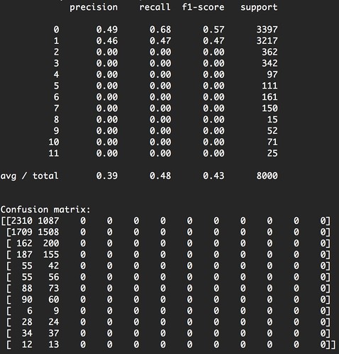
[Python] 機器學習筆記 - 透過 sklearn.svm 簡易的數據分析、機器學習萬用框架 @ macOS 10.12, Python36

svm_report

幾年前有幸參加過數據分析的黑客松,但是太耍廢了 XD 當下只用統計硬幹。最近有些閒情想好好認識一下 SVM 了。目前使用它的方式很粗淺 XD 就是把一堆 feature 湊個成 array 餵進去跑,接著就有報表可以看了(當初還人工去計算 precision / recall),回想起來真是青春啊

回過頭來,程式架構如下:

import numpy as np
import pandas as pd # 假設 input 是 csv 格式

# 讀取資料中
raw = pd.read_csv("input.csv")
# 可以得知有多少欄位可以用
print(raw.columns)

# 假設所有屬性都是可以有一對一的對應,全部把他們取代成整數,此為 HASH table 用來轉換而已
LOOK_FIELD = {}

# 假設 raw 有一萬筆資料
USE_DATA_COUNT = 10000 # or raw.size

# 將 raw 資料建置成 numpy array 架構

data_input = None
data_output = None

for index, row in raw.iterrows():

data_per_row = np.empty([])

# 將有興趣的欄位(feature)抽出來使用
for field_name in [
"csv_fieldname1",
"csv_fieldname2",
]:
field_data = np.zeros(1, dtype=np.int)
if field_name not in LOOK_FIELD:
LOOK_FIELD[field_name] = {}
if row[field_name] in LOOK_FIELD[field_name]:
field_data[0] = LOOK_FIELD[field_name][row[field_name]]
else:
field_data[0] = len(LOOK_FIELD[field_name])
LOOK_FIELD[field_name][row[field_name]] = field_data[0]
data_per_row = np.append(data_per_row, field_data.reshape(1, -1))

if data_input is None:
data_input = np.zeros([USE_DATA_COUNT, data_per_row.reshape(1, -1).size], dtype=np.float)
data_input[index] = data_per_row.reshape(1, -1)


result = np.zeros([1], dtype=np.int)

output_field_name = "csv_fieldname3"

# 將 結果 的欄位轉換成數值
if output_field_name not in LOOK_FIELD:
LOOK_FIELD[output_field_name] = {}
if row[output_field_name] in LOOK_FIELD[output_field_name]:
result[0] = LOOK_FIELD[output_field_name][ row[output_field_name] ]
else:
result[0] = len(LOOK_FIELD[output_field_name])
LOOK_FIELD[output_field_name][ row[output_field_name] ] = result[0]

if data_output is None:
data_output = np.zeros([USE_DATA_COUNT, result.reshape(1, ).size], dtype=np.int)
data_output[index] = result.reshape(1, )

# 支援只使用 USE_DATA_COUNT 筆資料
if index >= USE_DATA_COUNT - 1:
break

print(data_input)
print(data_output)
print(data_input.shape)
print(data_output.shape)

from sklearn import svm, metrics

classifier = svm.SVC()

# 使用 1/5 的資料來訓練
number_of_data_to_learn = int(USE_DATA_COUNT / 5) # or int(data_output.size/5)

# start to learn
classifier.fit(data_input[:number_of_data_to_learn], data_output[:number_of_data_to_learn])

# get the result
expected = data_output[number_of_data_to_learn:]
predicted = classifier.predict(data_input[number_of_data_to_learn:])

# get the report
print("Classification report for classifier %s:\n%s\n" % (classifier, metrics.classification_report(expected, predicted)))
print("Confusion matrix:\n%s" % metrics.confusion_matrix(expected, predicted))


透過上述的程式架構,未來就只要把資料轉成 csv ,挑挑 feature (csv_fieldname1, csv_fieldname2) 跟 output (csv_fieldname3) 欄位就可以快速看到成果了 XD 要唬人也可以 3 分鐘就弄出點東西。

2017年8月16日 星期三

[Python] 機器學習筆記 - 使用 matplotlib.pyplot 快速上手繪圖方式 @ macOS 10.11, 10.12 / Python36

最近想嘗試分析資料,看了一堆教學文都會看到繪圖的函式,如 plt.subplot, plt.plot, plt.show 等等,花了一點時間看看別人的範例,終於看懂了 XD 其實也沒有太複雜。

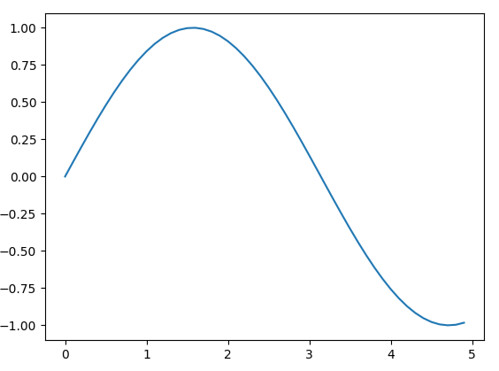
畫一個正弦波:

x=0-5,y=sin(x)

import numpy as np
import matplotlib.pyplot as plt

x = np.arange(0, 5, 0.1);
y = np.sin(x)
plt.plot(x, y)
plt.show()


其中 np.arange 的參數是 x 介於 0 ~ 5 ,並且以 0.1 間隔產生,所以真正產生的數字序列為:

[ 0.   0.1  0.2  0.3  0.4  0.5  0.6  0.7  0.8  0.9  1.   1.1  1.2  1.3  1.4
  1.5  1.6  1.7  1.8  1.9  2.   2.1  2.2  2.3  2.4  2.5  2.6  2.7  2.8  2.9
  3.   3.1  3.2  3.3  3.4  3.5  3.6  3.7  3.8  3.9  4.   4.1  4.2  4.3  4.4
  4.5  4.6  4.7  4.8  4.9]


接著,在定義 y 的數值是怎樣產生,就用 plt.plot 把它畫出跟展現出來。

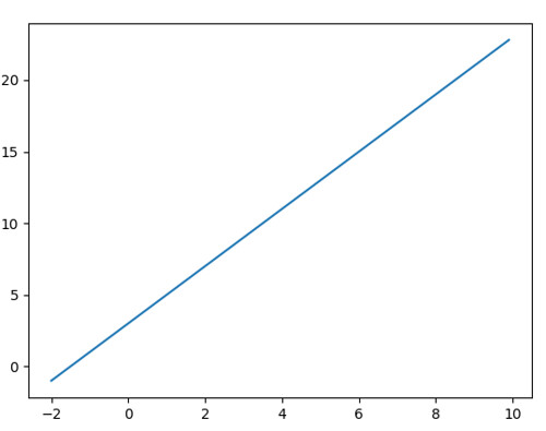
同理,簡單畫出個 y = 2x + 3, -2 <= x <= 10

x=-2-10,y=2x+3

import numpy as np
import matplotlib.pyplot as plt

x = np.arange(-2, 10, 0.1);
y = x * 2 + 3
plt.plot(x, y)

plt.show()


以上就快速明瞭畫圖的方式了,接著談談一張圖多個小圖,或是一口氣產生多個圖的方式。

對於一張圖有多個小圖的部分,會使用到 plt.subplot ,他吃的參數有 3 欄,也有人喜歡給一個三個位數的整數給他:

plt.subplot( x, y, z ) 或 plt.subplot(xyz)

其中 x 代表 row,y 代表 column 而 z 代表 location (顯示位置)

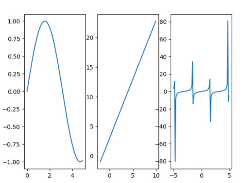
例如,想要做出一張有三個小圖的圖表,就可以用 row=1, column=3,接著開始作畫:

draw3

import numpy as np
import matplotlib.pyplot as plt

# draw 1 picture
plt.subplot(1,3,1)

x = np.arange(0, 5, 0.1);
y = np.sin(x)
plt.plot(x, y)

# draw 2 picture
plt.subplot(1,3,2)

x = np.arange(-2, 10, 0.1);
y = x * 2 + 3
plt.plot(x, y)

# draw 3 picture
plt.subplot(1,3,3)

x = np.arange(-5, 5, 0.1)
y = np.tan(x)
plt.plot(x, y)

plt.show()


如何在程式內一次畫多張畫布,就是用 plt.figure 來處理了

import numpy as np
import matplotlib.pyplot as plt

# draw 1 picture
plt.figure(1)

x = np.arange(0, 5, 0.1);
y = np.sin(x)
plt.plot(x, y)

# draw 2 picture
plt.figure(2)

x = np.arange(-2, 10, 0.1);
y = x * 2 + 3
plt.plot(x, y)

# draw 3 picture
plt.figure(3)

x = np.arange(-5, 5, 0.1)
y = np.tan(x)
plt.plot(x, y)

plt.show()


結果就會產出三張圖。

最後,談談環境架設的部分,這次分別在 macOS 10.11 跟 macOS 10.12 嘗試過,兩邊都分別用 MacPorts 安裝 python 3.6 和 pip 套件,並從 XQuartz 網站下載視窗軟體。

連續動作:

1. 安裝 https://dl.bintray.com/xquartz/downloads/XQuartz-2.7.11.dmg 後重開機(很重要 XD)
2. 安裝 py36-pip py36-virtualenv 和 matplotlib 繪圖需要的函式庫 py36-tkinter
3. 使用 virtualenv 建置環境,並把缺的 py36-tkinter library 移入使用
4. 安裝 matplotlib、numpy 等常用工具
5. 收工,可以把玩繪圖了

$ sudo port install py36-pip py36-virtualenv py36-tkinter
$ virtualenv study
$ source study/bin/activate
$ cd study/lib/python3.6/site-packages
$ ln -s /opt/local/Library/Frameworks/Python.framework/Versions/3.6/lib/python3.6/site-packages/_tkinter.cpython-36m-darwin.so  .
$ cd -
$ vim ~/.matplotlib/matplotlibrc
backend: Tkagg
(study) $ pip install matplotlib
(study) $ python draw.py


錯誤處理:

import _tkinter # If this fails your Python may not be configured for Tk
ModuleNotFoundError: No module named '_tkinter'

$ sudo port install py36-tkinter
$ cd path-virtual-env-project/lib/python3.6/site-packages
$ ln -s /opt/local/Library/Frameworks/Python.framework/Versions/3.6/lib/python3.6/site-packages/_tkinter.cpython-36m-darwin.so  .


參考資料:

1. https://matplotlib.org/users/pyplot_tutorial.html
2. https://matplotlib.org/users/customizing.html

2017年7月17日 星期一

[Book] 你要如何衡量你的人生

之前被強者大大的塗鴉牆吸引到,仔細找了書來翻。有興趣的可以參考以下影片:


這些影片都提到了書中內容,有興趣可以看看(甚至快轉兩倍速節省時間也行),我覺得比較好玩的是這是以“企業管理”的角度去思索人生規劃,當我跟其他強者大大哈拉時,他們立馬就說:有沒有用“軟工”衡量人生 XD 接著就蹦出一堆搞笑的話題,例如可以 waterfall 嗎、可以 CI/CD 嗎?

回過頭來,每個人在不一樣的心境,看著一樣的文字,的確還是會有不一樣的想法跟心得,有人覺得囧星人已經總結了很多關鍵概念,不需在翻書,我自己看完書的心得,大概就像知道 QuickSort 跟實際在寫一次還是很不一樣的,可能碰到 bug 而多想了很事多練了一些經驗值。這次閱讀有不少共鳴是從工作上來的,包含企業經營的策略,卻又有一大卡車的領悟是跟小孩互動學習。

例如提到小時候要多跟小孩講話(字彙),雖然小孩不是很懂,但長期下來接受到的字彙刺激會很驚人的,讓人想起 Deep learning 的相關用詞:神經元連結。永遠都不要小看那一點點的刺激,就可能讓小孩 Machine Learning 系統有了更新穎的連結。

不知是不是年紀已到?累積一些工作經驗後,覺得這本書很對味,適合閒暇時翻翻,回顧一下工作上的營運策略,並想想人生在意的事,並付出行動去改變吧!